Psicóloga María Elena Torrealba
—
Rebrand
María Elena Torrealba, Psychologist, a highly active professional on social media, was experiencing growth and reach, alongside other projects. This was the main reason for revisiting her projection. Due to these changes, her graphic image had become outdated and overly complex, making it difficult to identify. Moving forward, with María Elena, we began to renew the shape.
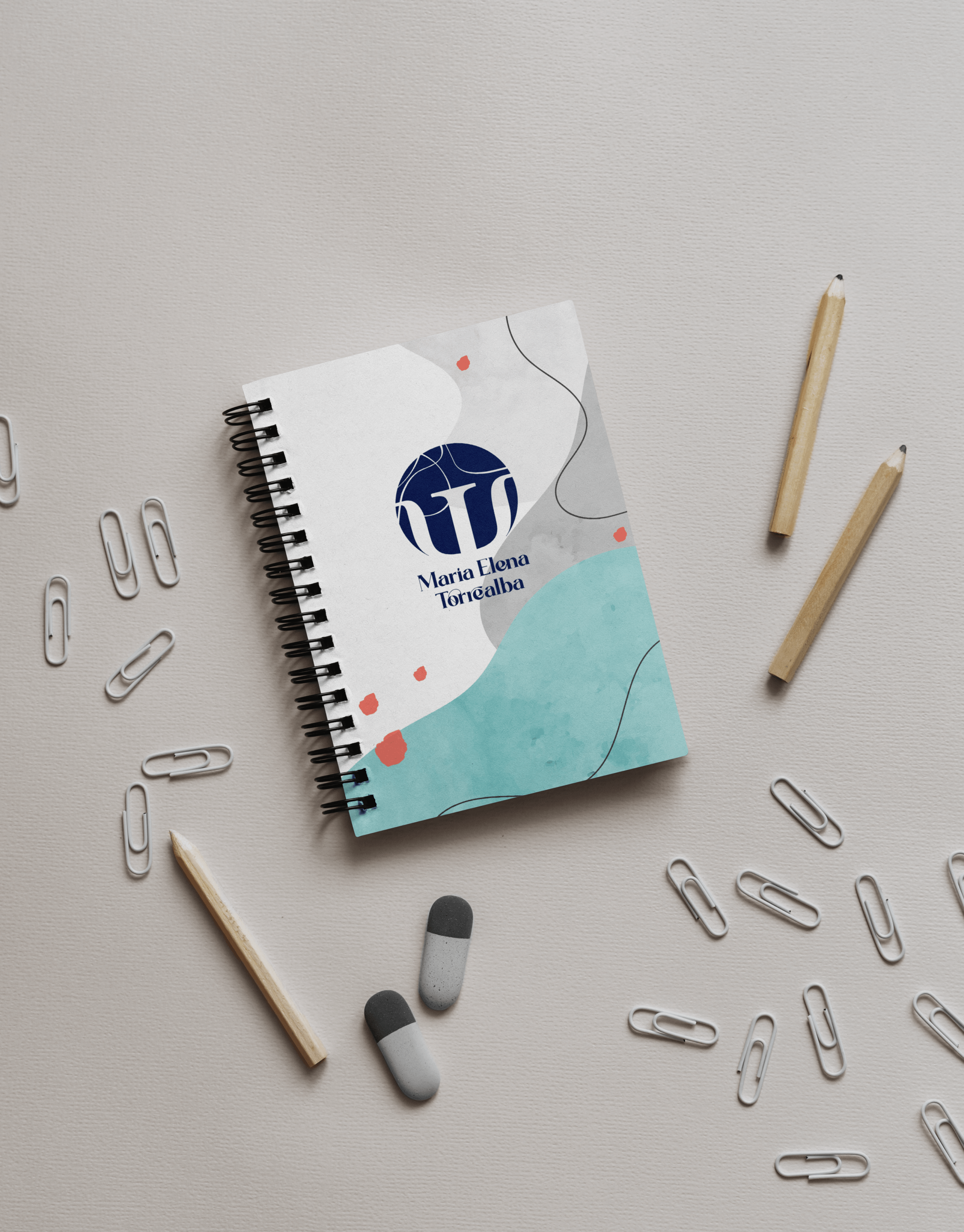
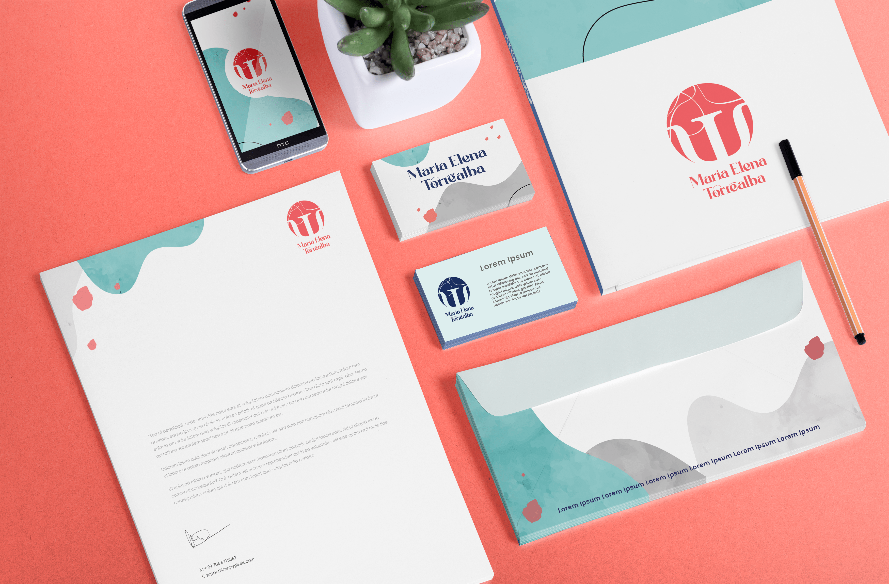
The result is now much more organic; the perforated symbol is a nod to the Gestalt psychology branch, precisely Maria Elena’s specialty, among others. In this way, we found differentiation from other psychologists in her field. This playful aspect of the logo holds meaning for the psychologist, while also representing her activity and connecting more closely with her patients. It’s no longer about rigid forms but rather a contemporary balance between geometry and the accompanying organic shapes.
Show you

The lines that fragment the circle are another metaphor in Gestalt and in psychology in general. We have taken this element forward as a playful resource present in the aesthetics of stationery, social networks, or any other application.
In this way, we are achieving differentiation and getting closer to our patients. From the previous logo, we only rescued two colors that were the most representative of her personal brand to maintain her visual reference in color.


